CRA Website
UI Design I Case Study I Government Website Redesign
The CRA website holds immense importance for users as it serves as a vital resource for managing their taxes and accessing crucial benefit programs. The redesign prioritizes user needs and aims to create an intuitive, streamlined experience.
Role
UI Designer
(Solo Project)
Time Span
May-June 2023
Tools
Figma, Google Slides, Maze, Zoom, Canva
-min.png)
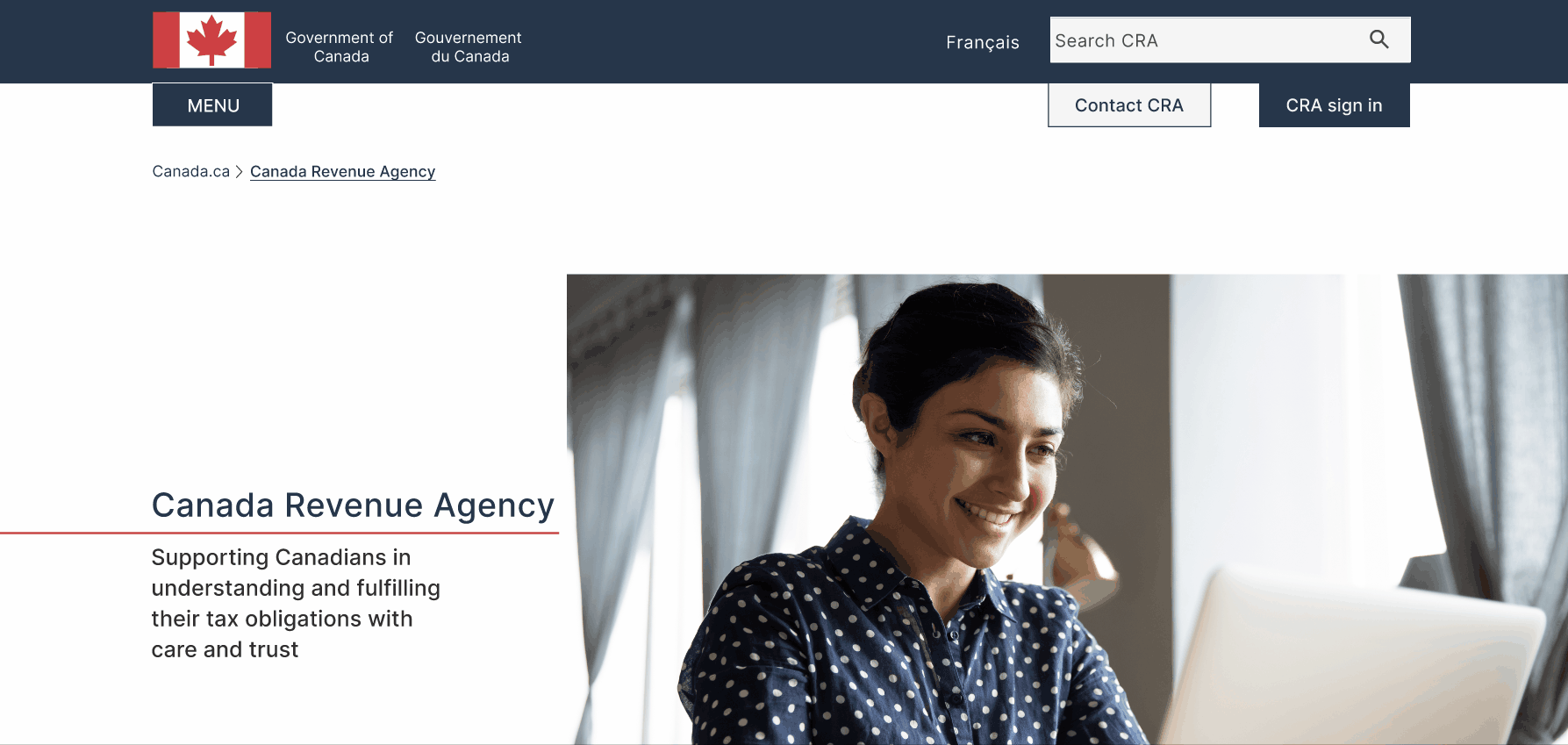
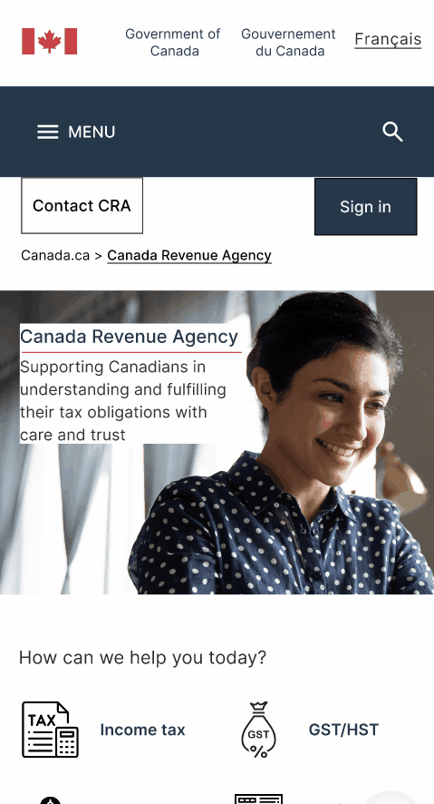
The CRA website's complex navigation and page structure cause frustration as users struggle to find information. The lack of a 'human touch' due to limited visuals and unwelcoming content tone creates a disconnected user experience.
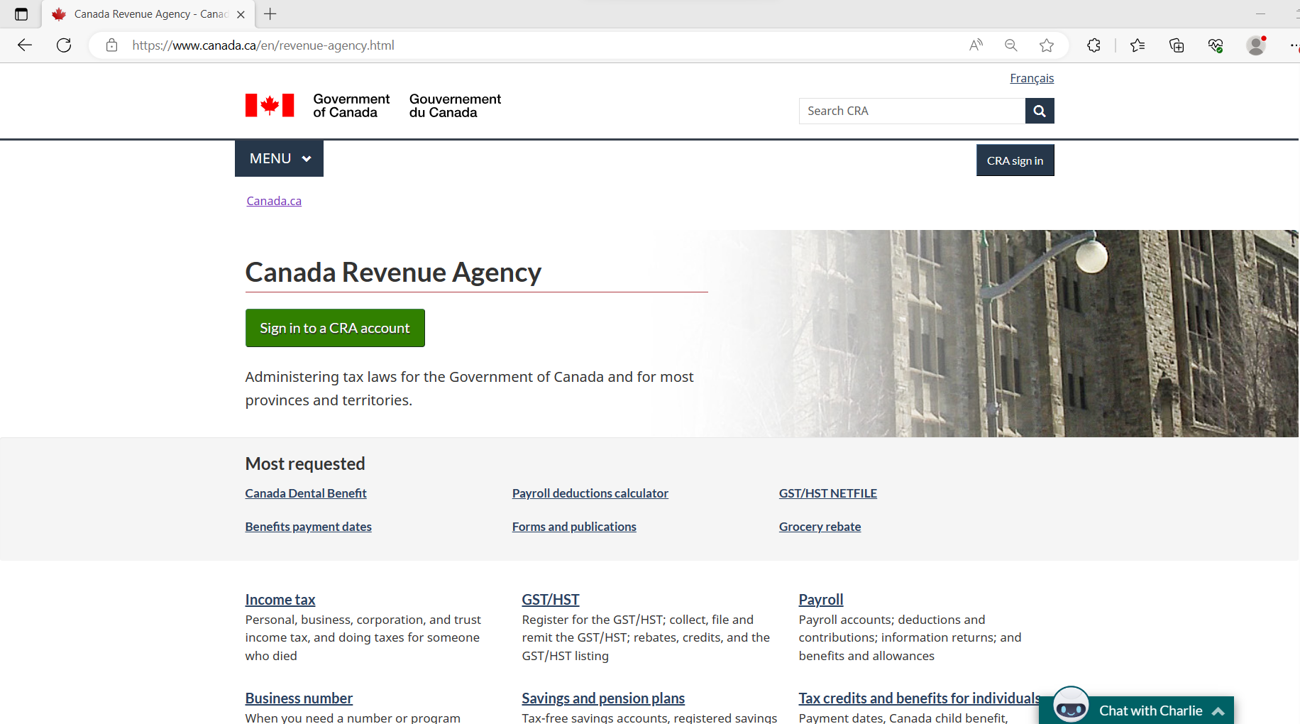
Current CRA Website
To better understand CRA website navigation, a user path was defined for the case study - Applying for Canada Dental Benefits. I focused on this path to gain a deeper insight into the core issue causing the agony among users and derived at a solution-based redesign based on user feedback.
The Solution
To address the navigation and user path issues when applying for Canada Dental Benefits, our focus is on understanding the challenges users encounter on the website and improving the navigation experience.
User Path
🗺️The defined User Path for Applying for Canada Dental Benefits on the CRA website.
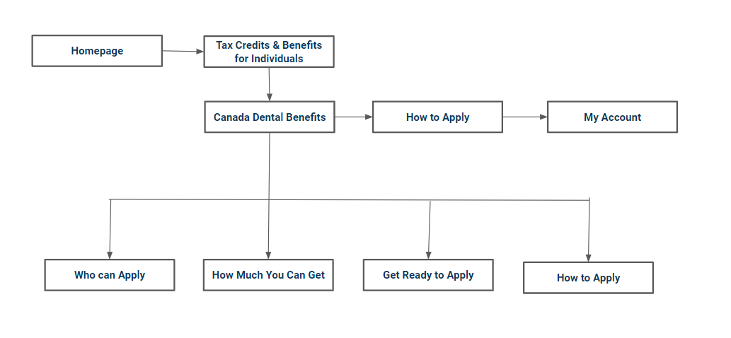
Symbolic User Path Flow Chart
User Path Stepwise
- The user lands on the CRA website
- Clicks on 'Tax credits and benefits for Individuals'
- Goes to 'Canada Dental Benefits Page'
- Here the user can check eligibility, and the applicable amount, and prepare to apply
- The user clicks on 'How To Apply'
- On the page user is then prompted to 'Apply using CRA My Account'
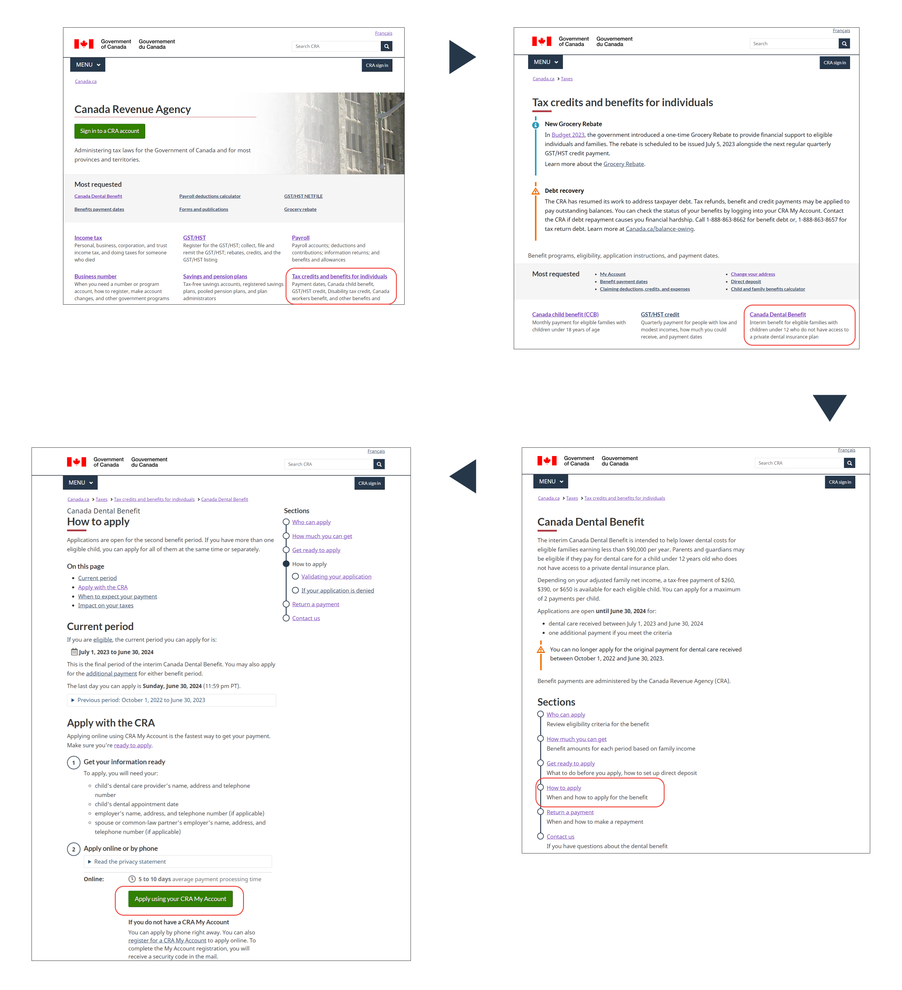
Wire flow of the User Path
User Persona
The user persona of a typical CRA website user looking for Canada Dental Benefits.
👩Meet Leila Wei a 35-year-old Graphic Designer and a stay-at-home mom of two kids. Leila recently moved to Canada from China and learned about the dental benefits she can avail for her children.
☹️She knows the requirements, but it's challenging for her to navigate the process because she doesn't have much time and the website is not user-friendly and uninteresting.
.png)
🕵️A Heuristic evaluation based on appearance, content, navigation, and efficiency was performed on the key pages from the user path of the CRA website.
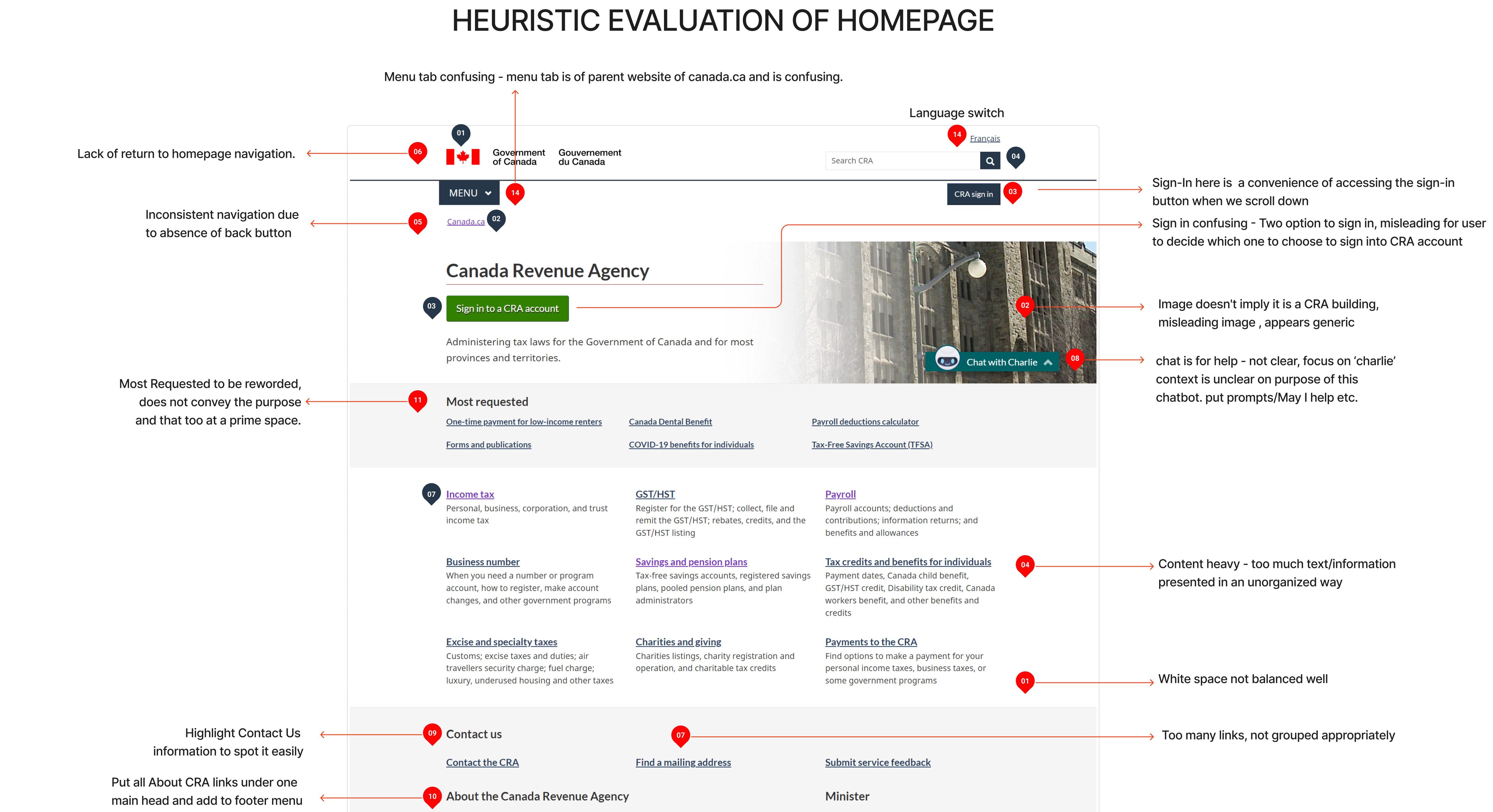
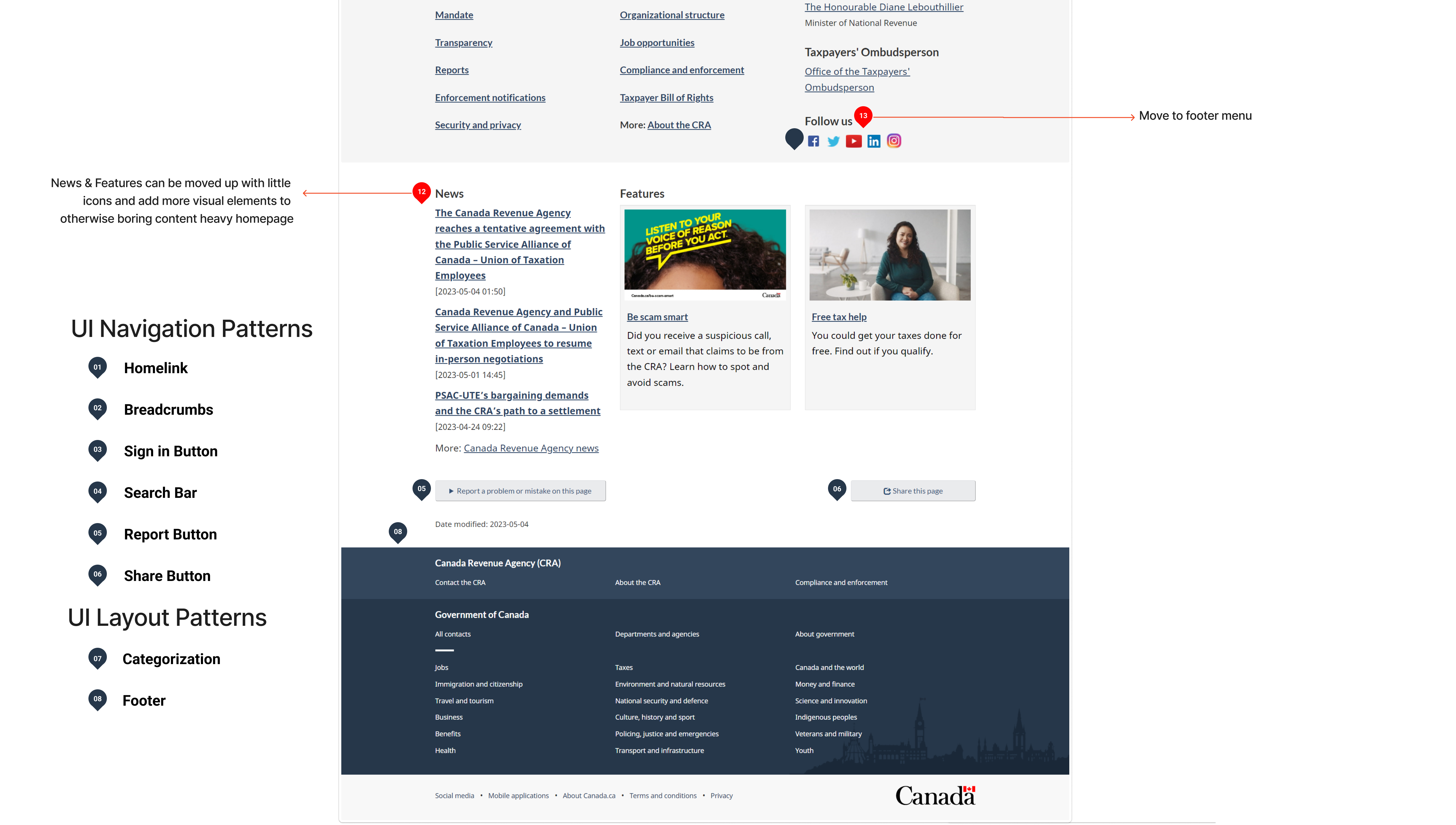
Nielsen and Molich's 10 User Interface Design Heuristics Evaluation of CRA
- VISIBILITY OF SYSTEM STATUS
- CONSISTENCY AND STANDARDS
- ERROR PREVENTION
- AESTHETIC & MINIMALIST DESIGN
👎
- MATCH BETWEEN THE SYSTEM AND
THE REAL WORLD
- USER CONTROL AND FREEDOM
- RECOGNITION RATHER THAN RECALL
- FLEXIBILITY & EFFICIENCY OF USE
- HELP USERS RECOGNISE & DIAGNOSE AND RECOVER FROM ERROR
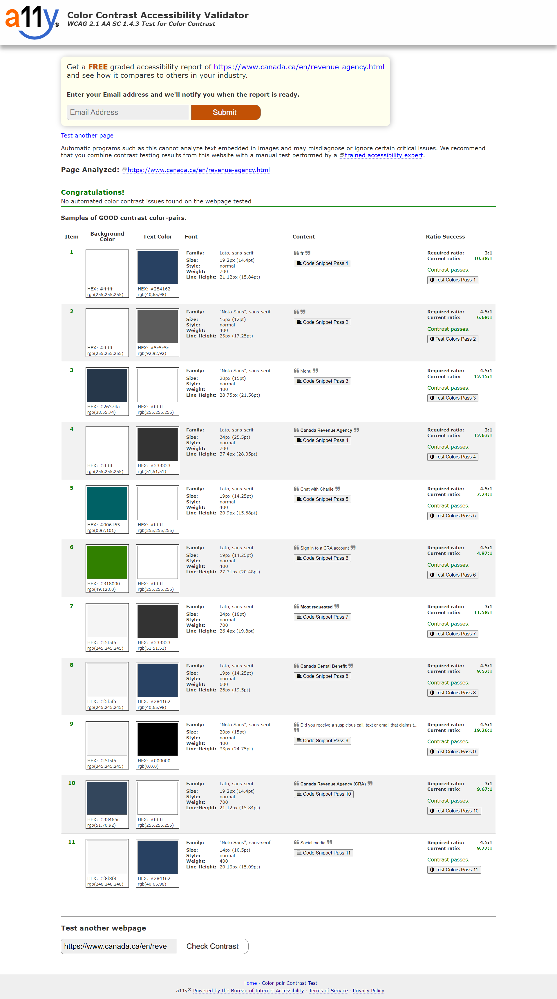
Color Accessibility
✅All website colors passed the accessibility test, ensuring an inclusive and user-friendly design.
Usability Test - Original Website
🕵️♀️To further understand the problems with the CRA website on the defined user path, I conducted 5 Guerilla Usability Tests. I defined 4 tasks for the user to perform on the given path of ‘Canada Dental Benefits’ of the CRA website.
Main task given to users -
To apply for Canada Dental Benefits for children below 12 years of age.
For the testing, I shortlisted -
👨👩5 working/studying parents with children below 12 years of age.
👥👥4 regular users of the CRA website, and👤 1 is not.
🧐To help us understand different perspectives while doing the given tasks and overall experience of the CRA website from both a regular and a new user.
4 Tasks Tested
Task 1. To find Canada Dental Benefits
Task 2. To go back to CRA Homepage
Task 3. To apply for dental benefits for children
Task 4. To sign in to their CRA account
Interviewee Speaks
Lots of texts on the home page and I need help figuring out where to start! - User 1
Moving around on this website is a bit tricky as there are so many categories that I don't understand.- User 2
I like the search function, it is good as it saves all my past searches - User 3
The navigation line should be clear at any point of time on the website as I feel lost sometimes! - User 4
I thought the menu is of CRA, I am not sure - User 5
Feature Prioritization Matrix
After analyzing the results of our usability tests, I organized the findings into an affinity diagram. From there, I categorized the responses and further ranked them as per frequency (high, medium, average, low) of occurrence. Post that, we created a feature prioritization matrix.
.png)
Affinity Diagram
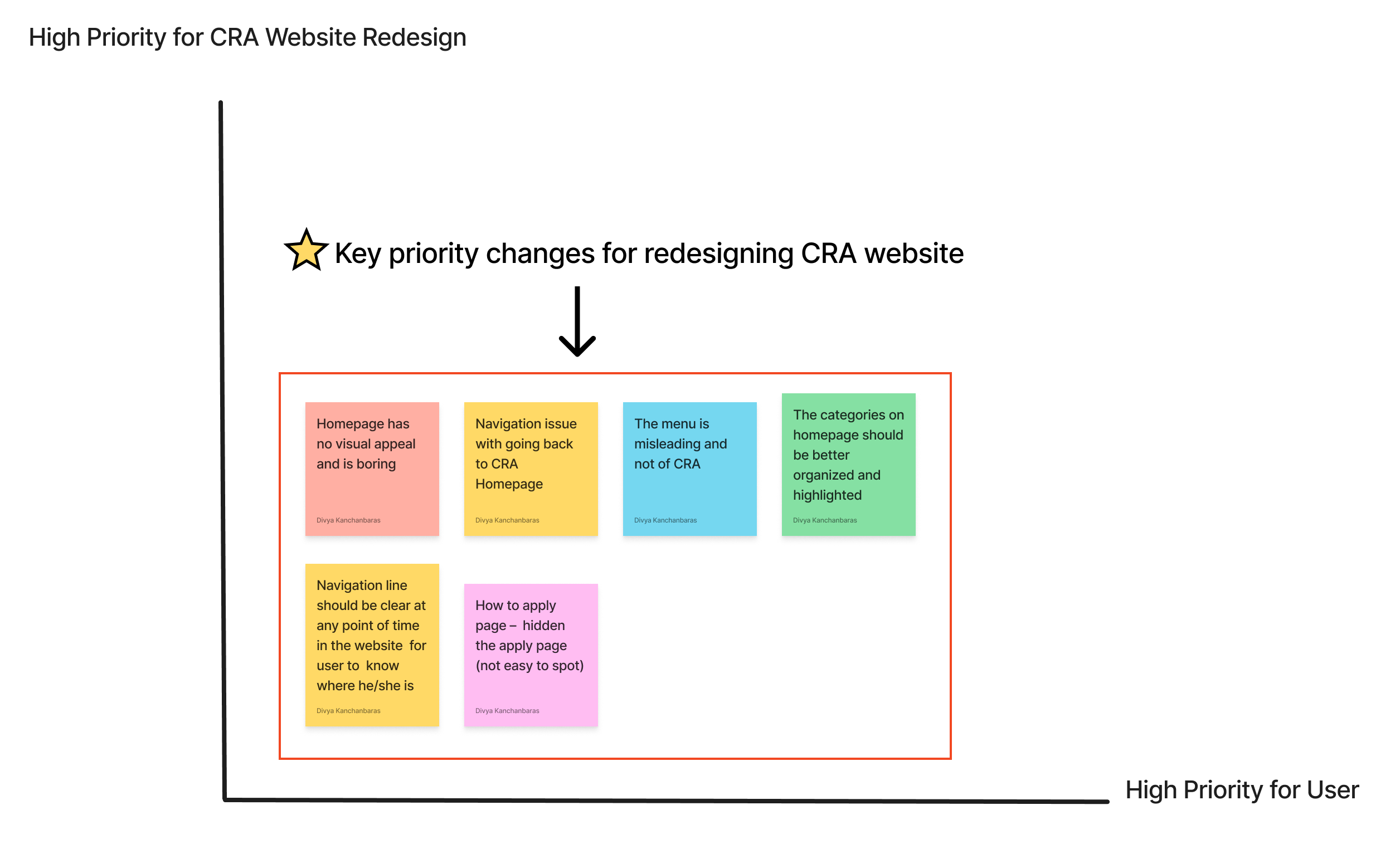
Feature Prioritization 2 by 2 Matrix For CRA Website Redesign
🔑Key Insights
😖In the Guerrilla tests, users mentioned that the website has a text-heavy design which made navigation a bit confusing.
🤔Users expressed a desire for the CRA menu, provision to keep track of the navigation line, and easy access to the homepage at any point in time on the website.
😶It was also observed the website lacked a human connection with the user and was not inviting or welcoming.
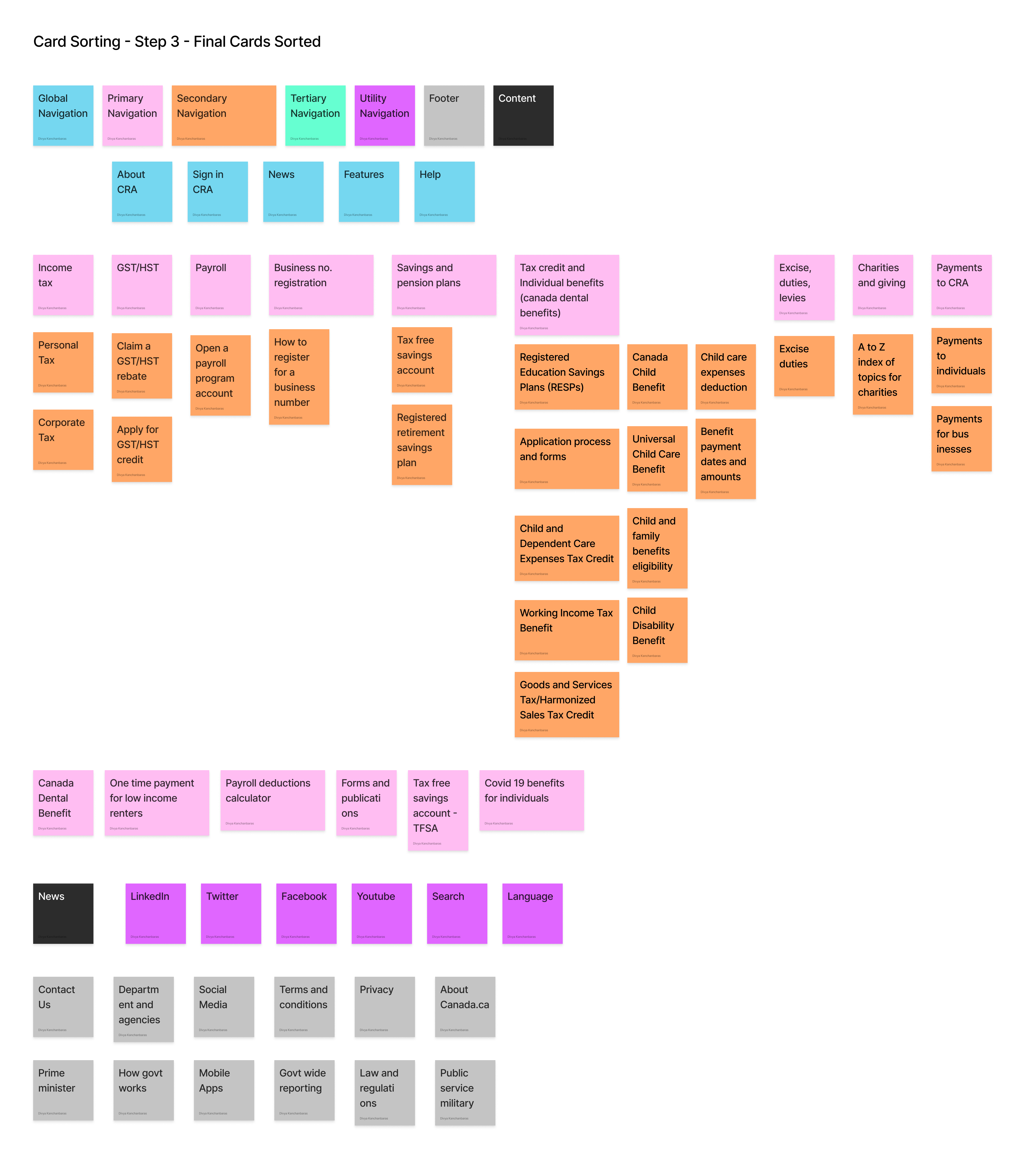
To address the issue of having too many topics in the primary navigation, I conducted open card sorting to determine the most effective categorization method for primary, secondary, and tertiary navigation in the UI case study.
♻️Open card sorting involved reorganizing the current primary navigation to find a more practical solution.
.png)
.png)
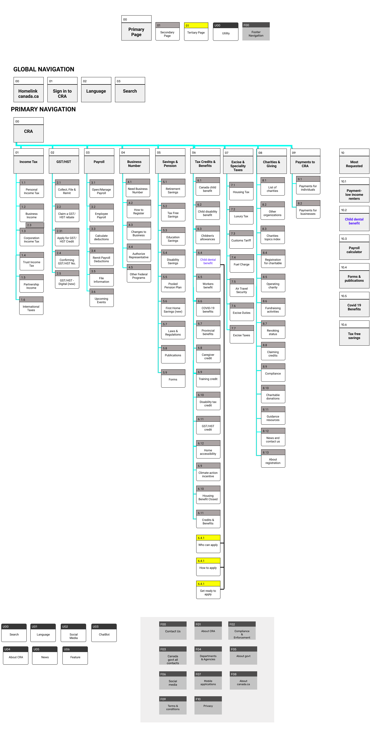
Sitemap
It was time to revamp the sitemap based on the card sorting.
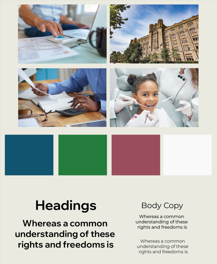
Moodboard
I created a straightforward mood board for the CRA website to guide the project's UI design choices.
🎨I maintained the original color palette of the website while aiming to create a welcoming atmosphere that conveys trust and care.
🎭These emotions are crucial when dealing with financial matters.
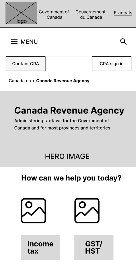
Lo-Fi Wireframe
Finally, it was time to bring the design to life based on all the UI research we had done incorporating the outcomes of heuristics, annotations, user testing, and information architecture for CRA redesign.
Desktop Wireframes
The wireframes were designed on 12 column grid system to achieve a responsive design
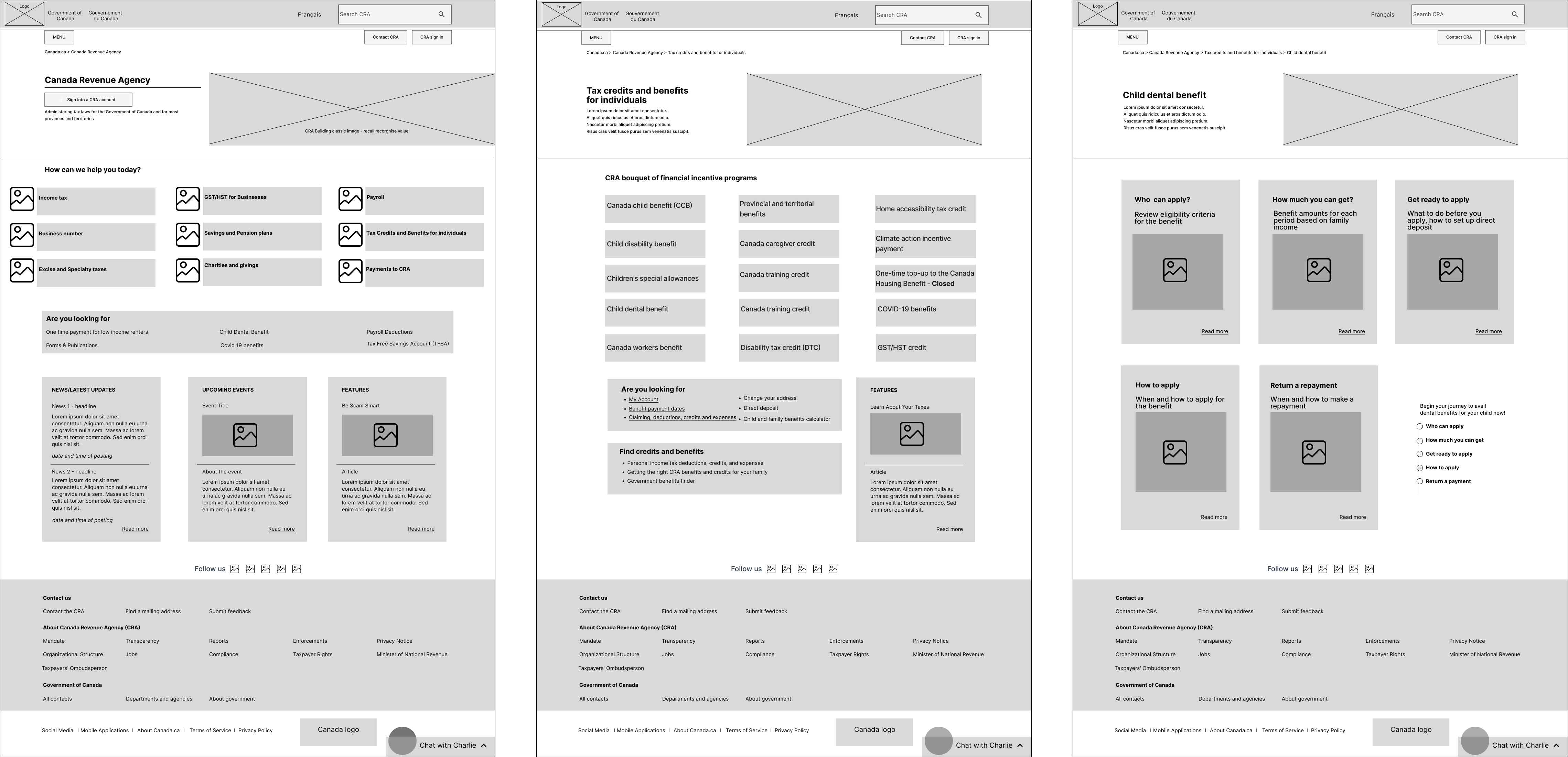
Homepage, Secondary Page & Tertiary Page
.png)
New CRA Desktop Homepage Lo-Fi Wireframe with Iterations
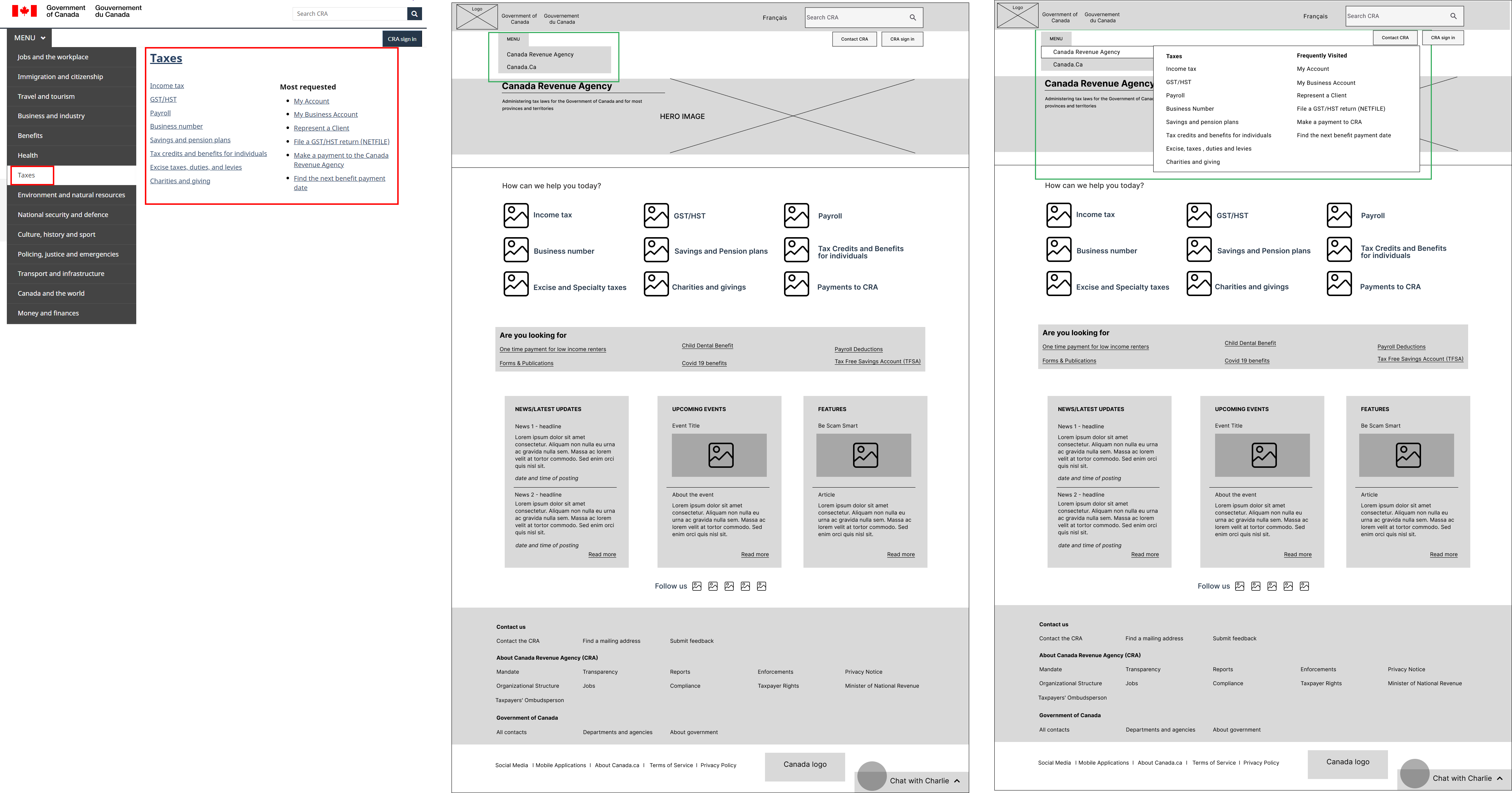
Main menu adapted to highlight the CRA website menu along with access to the Canada.ca website menu. The existing menu has a full detailed listing where Canada.ca and CRA menus were combined, which is confusing and overwhelming for users.
‘Taxes’ in current menu represents CRA menu which is not clear to the user, so the menu item changed to Canada Revenue Agency to clarify the point observed.
Mobile Wireframes
🧮The wireframes were designed on 4 column grid system to achieve a responsive design.
🙅As per user testing, the CRA website is accessed by none of the users over the mobile.
🤝All five users mentioned when it comes to finances, they trust the desktop over the mobile version of the CRA website.
🛠️I worked on the homepage to be shorter, making it less text-heavy and adding visual cues for guidance to achieve a mobile-friendly website.
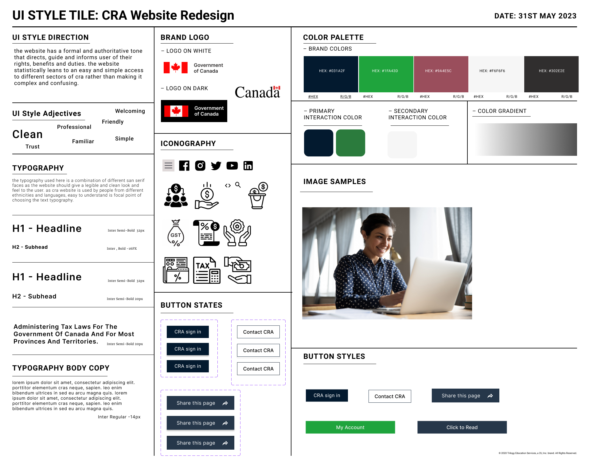
UI Style Tile
🎨 For the UI style tile, I developed a cohesive design by incorporating the overall mood from the mood board while refining the look and feel of the CRA website redesign.
🔎With a focus on creating a comprehensive UI style guide while still retaining the existing website's color palette to preserve successful elements from the current design.
Mid-Fi Wireframes
Desktop
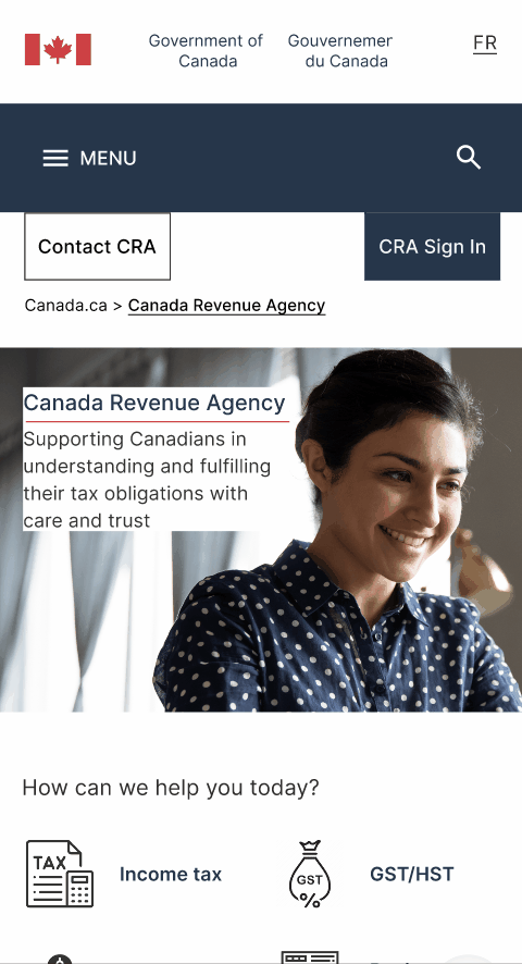
👩The inspiration for the hero banner image came from our users, many of whom are working mothers skillfully juggling the responsibilities of both raising children and managing taxes.
🕹️To enhance usability, I consolidated the CRA Sign In buttons on the homepage while incorporating a welcoming tagline in the hero banner based on user feedback about government websites being perceived as boring.
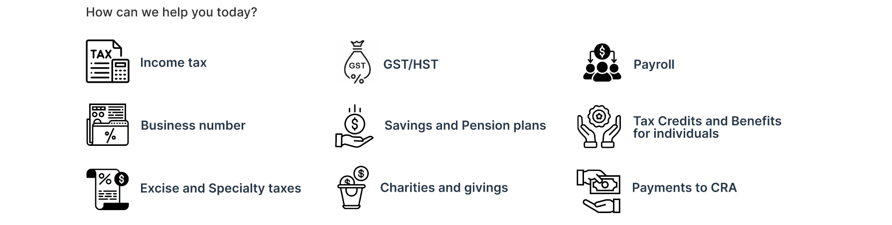
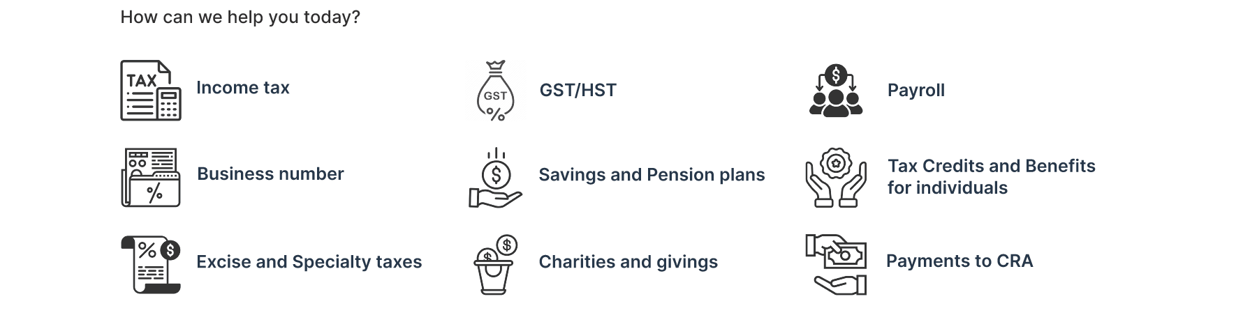
🪄Enhanced visual appeal and improved user comprehension, made by incorporating icons alongside the services, I aimed to provide a clearer and more intuitive representation of each service. This contributed to a cleaner and less text-heavy appearance on the page.
⬆️Based on valuable feedback from a peer, I recognized the importance of aligning the footer menu with our natural reading patterns for improved usability. Consequently, I reworked the layout of the footer menu from a horizontal arrangement to a vertical one to ensure that information is presented in a logical and sequential manner.
Mobile
🧦When creating the mid-fi wireframe for the mobile website, I ensured that all design iterations from the desktop version were taken into consideration, maintaining consistency across platforms.
🧗The layout for the swipe three cards section (news, events, and features) posed a challenge, but I aimed to maintain a cohesive design with the desktop homepage. After trying different box layouts, I ultimately decided to retain the swipe three cards layout for visual continuity.
⬆️In the original wireframe, the footer was initially presented horizontally. However, I made the decision to align it vertically, similar to the desktop version, to ensure a consistent user experience and design language.
5 Second User Testing
Desktop
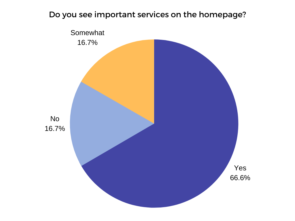
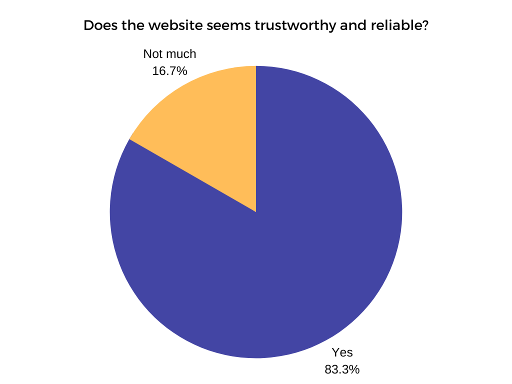
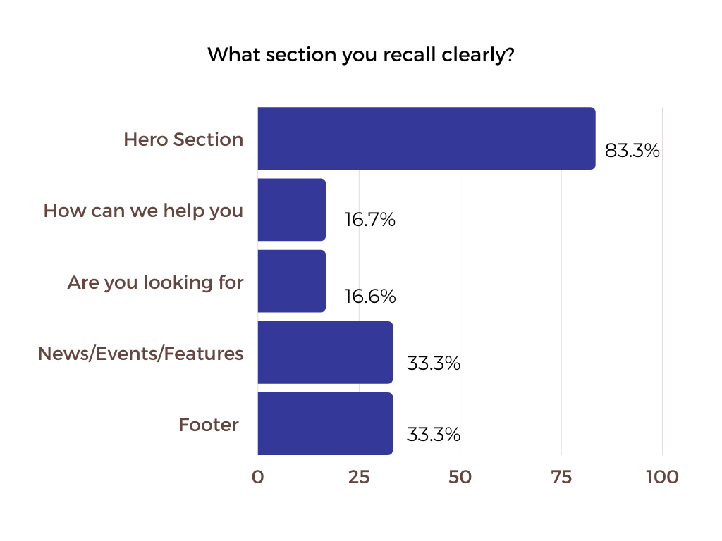
I conducted 5-second testing with a group of six users for our desktop version. This method allowed me to quickly gauge the effectiveness of key elements within the initial few seconds of user interaction, helping me prioritize clarity and immediate impact in the design.
Findings
- All 6 users could identify the main purpose or focus of the website being taxes
- 3 users recalled drop-down menu, search, call to action buttons, sign in buttons as actionable items from the page viewed
- 4 users could tell the target audience for the website is people who want to do their taxes/need help with taxes/who pay taxes
- 4 users feel the website seem trustworthy and reliable
- 3 users could recall icons and the hero section as the main thing from the homepage
- 3 users could identify the main services on the homepage
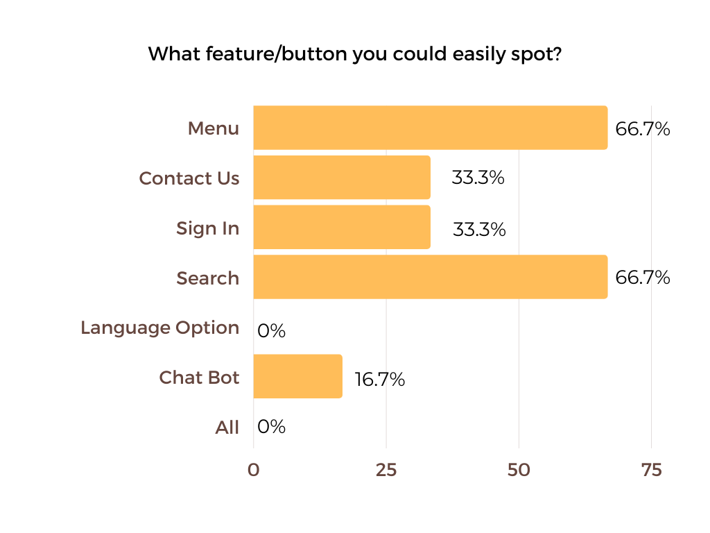
- 4 users could easily spot the menu and search button on the homepage
- 3 users could spot sign in and contact button
🔑Key Takeaways
👍Positive feedback from the user testing includes three users appreciating the use of icons and images, one user finding the design well-organized, and four users describing the homepage as clean, modern, and easy to navigate.
🗣️ The suggested changes include incorporating more vibrant colors, addressing spacing and margin issues, making the icons section more prominent, improving typography and hierarchy, and ensuring design consistency with the Canada.ca design system.
Mobile
I conducted 5-second user testing with a group of five participants using the UsabilityHub testing tool. This time, I narrowed down the questions to focus specifically on the mobile version of the desktop design, allowing me to gather valuable insights.
Findings
- All 6 users found the design clean, simple, and easy on the eyes, with a well-laid-out and organized layout.
- Users particularly appreciated the color scheme, the ample white space, and how the inviting icons encouraged them to explore further.
- All 6 users identified the mobile website as the CRA website
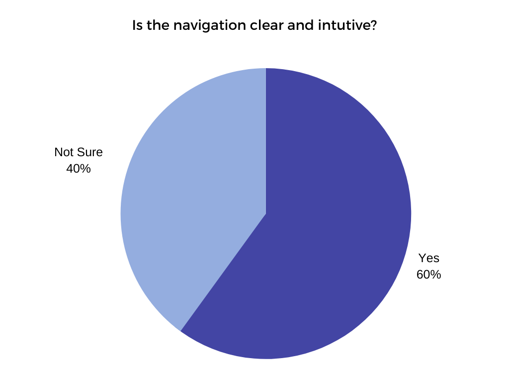
- 3 users felt the mobile website navigation is clear and intuitive
🔑Key Takeaways
- The suggested changes were to make the subcategories more prominent and visually distinct, ensuring they stand out to users for better navigation and comprehension.
Design Iterations Post 5 Second Testing
The menu display changed for quick access; earlier took 2 steps to see the main menu.
Desktop Before & After
Mobile Before & After
🔦I incorporated a main services hover to highlight, which serves as a visual cue to encourage users to click, interact and explore further. This addition aims to enhance the user experience by guiding them toward the primary services of the website
Before & After
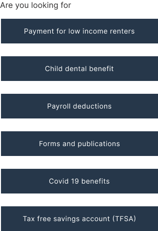
➡️Are you looking for listing on mobile changed from center aligned to left aligned to follow our natural reading pattern of left to right.
Before & After
Usability Test
In order to evaluate the usability of my mid-fi prototype after incorporating the insights from the 5-second testing, I began by developing a comprehensive usability test plan. This plan served as a guide to effectively assess the user experience and identify any areas for further improvement in the design.
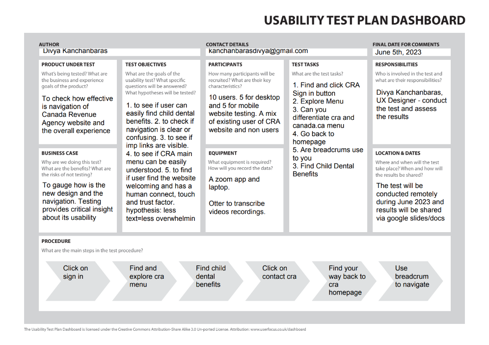
To ensure comprehensive coverage of usability from both desktop and mobile perspectives, I created separate usability test plans for each platform.
🧭For desktops, the focus was on navigation, information accessibility, and identifying key features/buttons.
🅰️For mobile, the emphasis shifted towards text legibility, gesture usability (tap, swipe), evaluating interactive elements like buttons, and overall mobile website navigation experience.
⏱️In this round of testing, I introduced timing for each task to gauge the efficiency of the new design, and users were also asked to rate their website experience on a scale of 1 to 10.
Usability Test Result
“Wow! I Love it; it looks very official, like a govt certified website. Icons are very appealing. Easy to scan. Like the text with icons is very helpful. Love the - looking for section and language used, the nice use of white space and color profile, the card feature is lovely, the impressive interactive touch and the footer looks professional. No more a boring government website for sure!”
🔑Key Highlights
- Users (mobile and desktop) found the new design clean, well laid out, and easy to scan
- Users appreciated the use of icons for main services, facilitating clear understanding of the offerings.
- Users welcomed the contact us CRA button in the top menu, providing quick access to the contact section.
- The sign-in CRA button was easily noticeable for all users.
- Users enjoyed the interactive elements, particularly the menu and main services on desktop, and the news/events/feature section on mobile.
- Mobile users found the text easy to read, gestures (swipe/tap) smooth, and the size of important UI elements (buttons) appropriate.
- The new design was perceived to have a human touch and was seen as welcoming by users
☹️The Struggles
- 3 out of 5 users expected a home icon/button to easily return to the homepage.
- 4 out of 5 users desired improved layout differentiation for sub-menu items in the mobile menu.
- While users could differentiate between the CRA and canada.ca menus on desktop, the same clarity was lacking on mobile.
- Some users suggested enhancing the text hierarchy for better readability and visual hierarchy
⏱️Time taken to do the tasks
- Task one - Find and click CRA Sign In Button; Average time users took was 1-3 seconds
- Task two - Find Child dental benefits; Average time users took was 2-8 seconds
- Task three - Find Contact CRA; Average time users took was 3-6 seconds
💯Average User Rating - Existing & Redesign
.png)
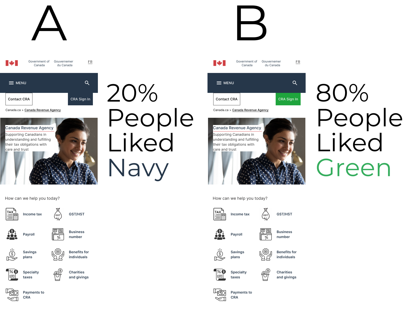
A/B Testing
🆎I conducted A/B testing for the CRA Sign button to avoid any negative impact on its visibility and usability. By presenting users with different color variations, I aimed to determine which color preference and design choice would prompt more clicks and improve the overall visibility of the sign-in button on the homepage.
📱💻This testing was seamlessly integrated into the usability test for both desktop and mobile versions, seeking user feedback on the preferred color that enhances the visibility and prominence of the sign-in button.
🎨Both color options, navy blue and green, were selected from the existing color palette of the CRA website. This ensured that the choices presented during A/B testing aligned with the established visual identity of the website.
Final Design Iterations
🧾Menu redesign: Eliminated arrows, improved text hierarchy, and differentiated between menus and sub-menu items for better user experience on mobile and desktop.
🏠Added home icon: Provided quick access to the mobile homepage for enhanced navigation.
✅Sign-in button: Changed to green color as a result of AB testing for improved visibility and user engagement on both mobile and desktop versions.
🖼️Mobile hero banner: Refined for a more impactful and visually appealing section.
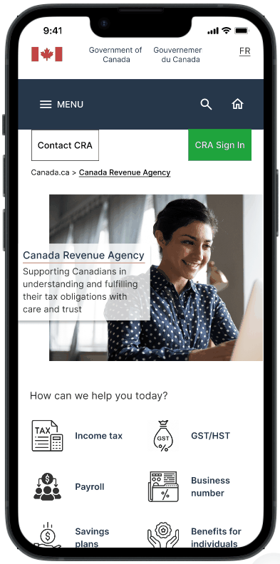
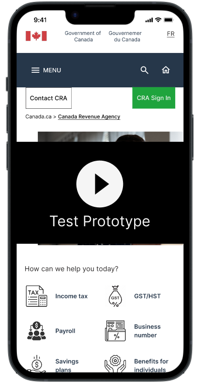
Hi Fidelity Prototype
Mobile
Desktop
.png)
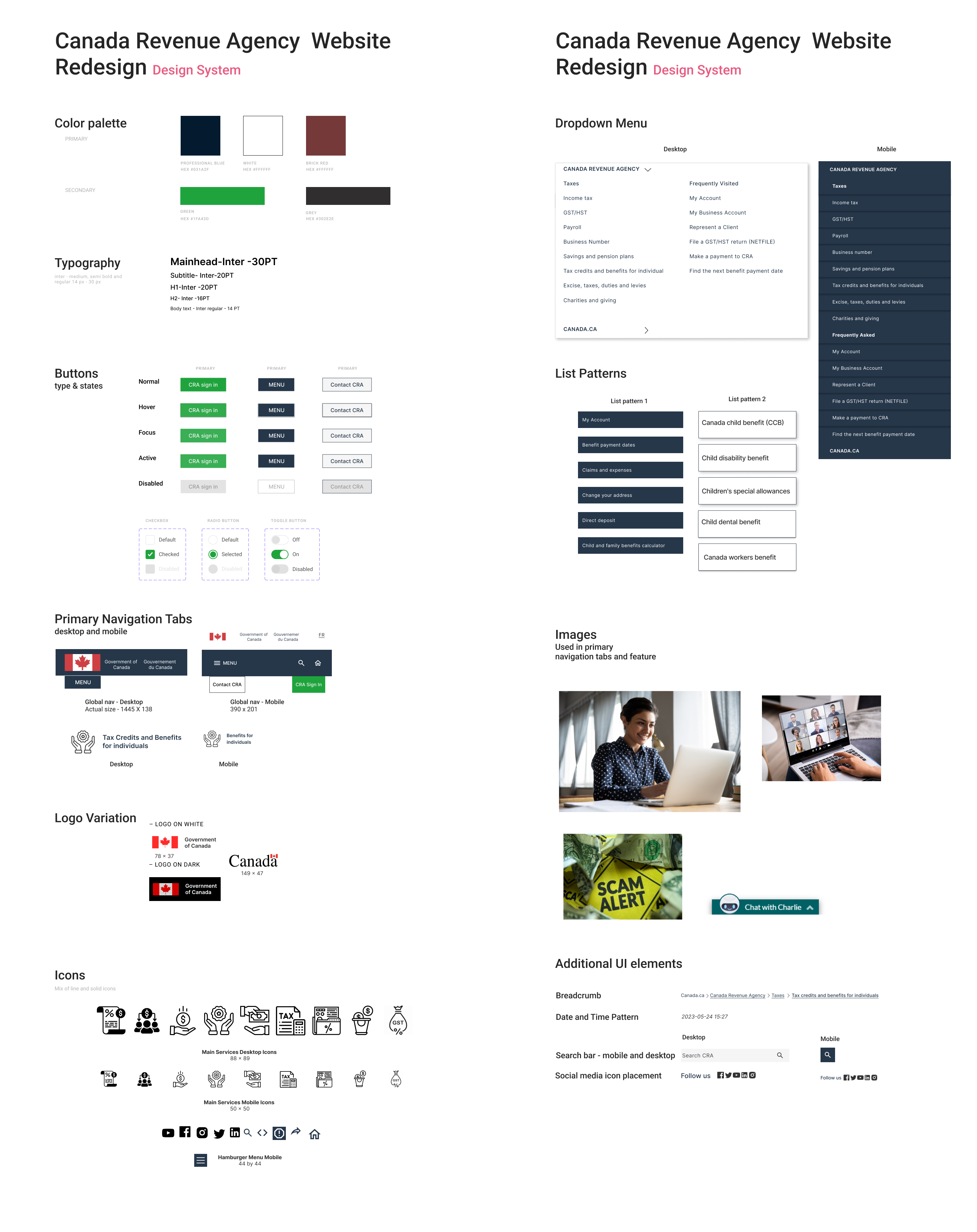
Design System
🛠️I built a comprehensive design system, incorporating the existing brand color palette that adhered to accessibility guidelines.
🧪A/B testing led to the change from a navy to a vibrant green sign-in button, aligning with the cohesive and inviting design system.
This system extended beyond the UI style tile, encompassing typography, spacing, layouts, and interactive components. It fostered collaboration, ensuring a unified understanding and facilitating future updates for an enhanced user experience.
Next Steps & Final Thoughts
Reflecting on this UI case study, I have identified key learnings and areas for continued growth and iteration in the CRA website redesign project. Moving forward, here are the next steps🪜:
🧠Card Sorting: Although challenging, I acknowledge the value of card sorting as an exercise to understand users' mental models and grouping preferences. I will explore conducting card sorting sessions with users to gain further insights, ensuring that our design aligns with their expectations and improves overall usability.
🅰️Text Hierarchy: I learned the importance of text hierarchy. The impact of implementing improved text hierarchy in the menu was evident during the final iterations. To build upon this success, I will continue to learn and enhance my understanding of text hierarchy principles, applying them consistently throughout the project.
🎮UI Research: I recognize the distinction between UI and UX research, with UI research focusing on the emotional aspects of user interactions. To ensure a delightful user experience, I will delve deeper into UI research methods and techniques, understanding how users feel while engaging with the website across different screens and devices. This will guide me in creating a more fluid and engaging experience.
⭕User-Centric Design: Balancing user preferences with the overall design theme is essential. In the final iterations, I successfully struck a balance that prioritized the user's needs. I will continue to iterate and seek user feedback to refine the design further, making user-centric decisions that enhance the overall experience.
💭This project has been a tremendous learning experience from a UI perspective, involving extensive utilization of tools and research. The project provided invaluable lessons on the importance of text hierarchy, fluid user experiences, and balancing user preferences with design aesthetics. This project served as a testament to the value of continuous growth and exploration in the ever-evolving field of UI design.
Next Case Study
.svg)
.png)

.png)
.png)
.png)
.png)

.png)

.png)